Getting started
Product basics
High-Level product overview of core features
Our mission at Rencore is to help you stay in control of your cloud technology by providing insights and empowering you to act. The core of our product is the inventory which reflects all of your Microsoft 365 data that we do scan, building upon this we use our core features Dashboards, Reports, Compliance, and Automations. In our Enterprise plan, we do extend these features with Provisioning and Access Reviews using the same data from the inventory.
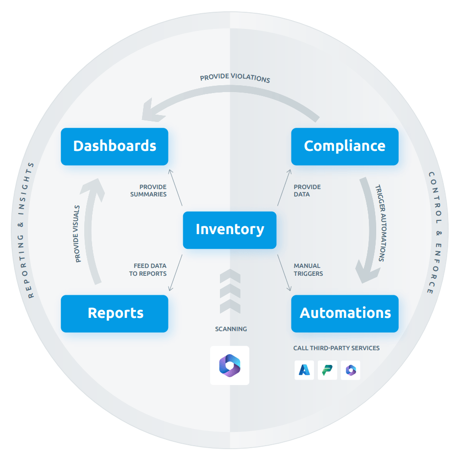
You can find out more about how Rencore Governance works in this blog post about How Rencore Governance can work for you.
Workspace
A workspace is a container to centrally manage all settings, connected apps, and users for all environments of the workspace. All data of a workspace is stored in the same data center and storage container and cannot be separated. The workspace contains the Dashboard, Inventory, Compliance, and Automations.
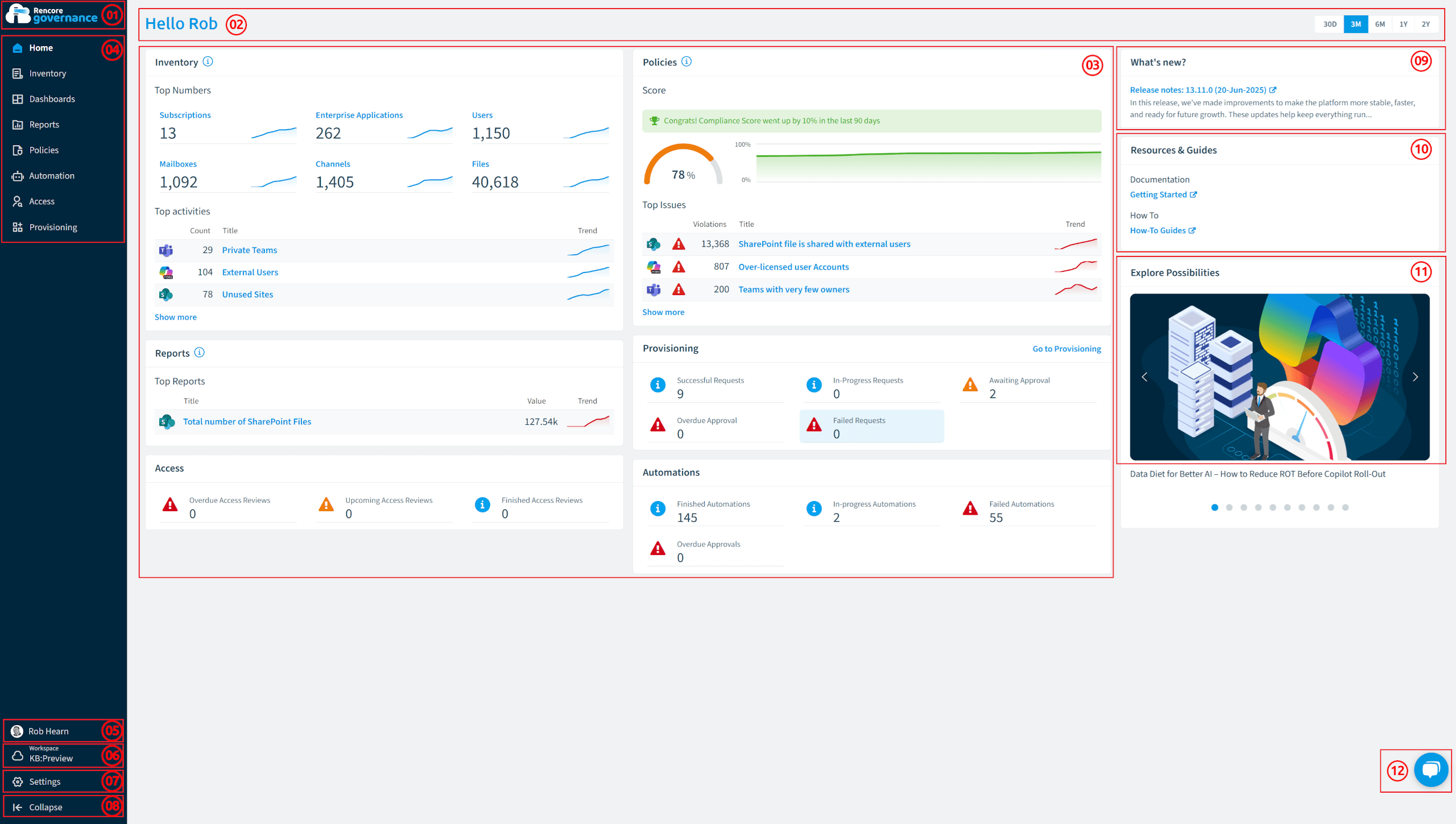
The dashboard section is comprised of 12 components.
-
Home Button: Clicking this will always return you back to the Default Dashboard.
-
Page Header: At the top of the page, you’ll find a greeting message on the left and a time period filter on the right. The filter allows you to choose between 30 days, 3 months, 6 months, 1 year, or 2 years.
-
Page Content: At the center of the page, you’ll find tiles presenting key thematic information, including charts and tables on Inventory, Policy Compliance, Top Report Changes, Automation Overviews, Access Reviews, and Provisioning Requests.
-
Navigation bar: This allows you to jump between Inventory, Dashboards, Reports, Policies, Automation, Access, and Provisioning.
-
User Profile: Shows the user profile preferences for the signed-in user, where you can add or change your First, last, and company name. Update your profile photo, add a phone number, and update your timezone. Set the date, time, and number format, and set your default workspace (defaults to the last one created) if not set. It also links to “Data Management” (Exports), and allows the user the option to “Sign out”.
-
Workspace & Environment Selector: This allows you to select the desired workspace (only when you have access to multiple workspaces), connected environments (tenants), and Virtual Environments (Tenant Segmentation).
-
Settings: Links to the Workspace Settings, Environment Settings, Users & Roles, and Account & Billing. It also provides links to Terms, Terms of Service, Copyrights, Privacy Policy, and Third-party licenses.
-
Workspace Settings: This shows the settings for the currently selected workspace:
- General Settings: You can edit the name and description of the workspace. The Workspace ID and datacenter are also shown here.
- Environments: Lists the current environments added to the workspace. You can add a new environment, add a new demo environment, edit an existing environment, manage the services for the environment, or view the job history.
- Appearance: Modify the branding and available features of the workspace and its environments.
-
Environment Settings: This shows the settings for the current environment.
-
Users & Roles: Here you can manage the users in the workspace, whether that is Invite, suspend, remove a user, or change the user’s role or team.
-
Account & Billing: This will take you to view the subscription.
-
Feedback: Here is where you give feedback on the tool. You can:
- Report a Bug.
- Request a Feature.
- Give General Feedback.
-
-
Collapse: Collapses or expands the Navigation Panel.
-
What Is New: This is where new Features, Compliance Policies, and Segments are announced. As well as messages from Rencore regarding the Governance Tool.
- Clicking on “read more” will provide more information about that notification.
-
Resources & Guides This is the central point for help with Rencore Governance here you can:
1.  Documentation: Links to our getting-started Documentation.
2. How to: Links to our knowledge base (How to).- Explorer Possibilities: This section displays the latest blog content automatically on the homepage, rotating through entries to keep users informed about new Microsoft 365 governance best practices and AI solutions, without requiring manual searching.
- Rencore Team Chat: Here, you can create a chat conversation with one of the Rencore Team Members.
Inventory
Inventory is your Microsoft 365 data structures that your organization is creating, such as SharePoint Sites, Teams, and Power Automate Flows. With the inventory, you can explore your environment and dependencies between objects to decide where you need to take action.
The Inventory section is comprised of 3 components.
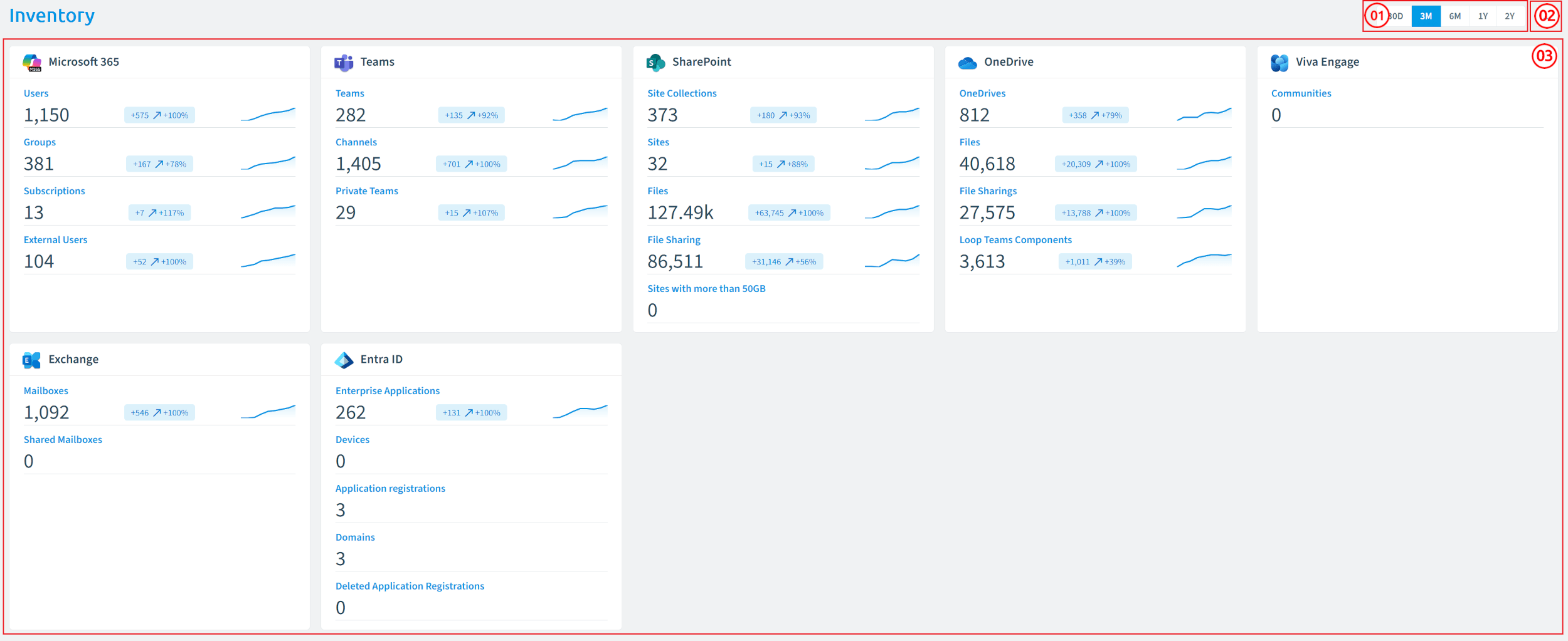
- Date Filter: As indicated in the diagram (position 1), the filter allows you to choose between 30 days, 3 months, 6 months, 1 year, or 2 years of the tile data.
- Inventory Options: As indicated in the diagram (position 2). Clicking on the ellipses displays the options for the inventory, where you can configure objects, go to the main inventory objects, or go to Scan history (All scans).
- Service Tiles: As indicated in the diagram (position 1). The main objects are displayed for each service. Hovering over a service tile and clicking “Go to Inventory” will load all the inventory of objects for that service.
Inventory Objects
After selecting “Go to Inventory” for a service, you will find the Inventory Object for that service. Here you will find:
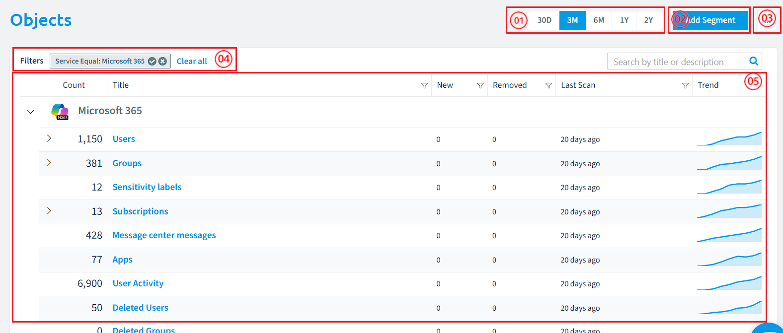
- Date Filter: As indicated in the diagram (position 1), the filter allows you to choose between 30 days, 3 months, 6 months, 1 year, or 2 years of the objects’ trend.
- Add Segment: As indicated in the diagram (position 2), the “Add Segment” button is on the top-right of the screen and is used for adding segments to entities.
- Object Options: As indicated in the diagram (position 3), clicking on the ellipses displays the options for the inventory. You can add segments, import segments, view all scans, or configure objects.
- Current Filters: By default, the filters will be applied to the service you selected previously. You can remove individual filters or all filters.
- Inventory Objects: As indicated in the diagram (position 5), the Objects of the service, the New and Removed count, the date of the last scan, and the trend as per the selected date filter.
Dashboards
Selecting Dashboards opens an additional panel where you can select a desired dashboard or go to all dashboards. A dashboard is a means to group reports, Policies, and KPIs in a meaningful way. Dashboards can be shared with people so that your relevant stakeholders are always informed about potential issues.
The dashboard section comprises 8 components.
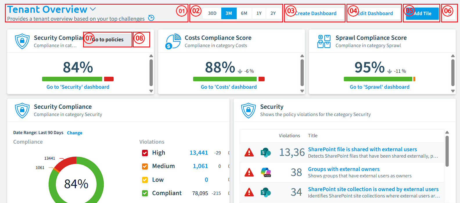
- Dashboard Selection: As indicated in the diagram (position 1), the dashboard selection can be found at the top left of the dashboard page.
- Date Range Selection: As indicated in the diagram (position 2), the date range filter will override the date ranges for individual tiles. This value defaults to “Last 30 Days”, but can be set to Last 90 Days, This Month, This Year, or a Custom Range.
- Create Dashboard: As indicated in the diagram (position 3), this button leads to the “Dashboard Template Library”, where you can add a prebuilt dashboard or create a custom dashboard.
- Edit Dashboard: As indicated in the diagram (position 4). Allows you to edit the existing dashboard. You can remove, resize, and move tiles on the dashboard.
- Add Tile: As indicated in the diagram (position 5), this button leads to the “Dashboard Tile Library”, where you can add prebuilt tiles to the dashboard or create a custom tile.
- Dashboard Menu: As indicated in the diagram (position 6), selecting this provides you with the options to Import a dashboard, Clone a dashboard, Save as template, Manage dashboards, set the dashboard as a default, Export the dashboard, share the dashboard, Manage Shared Dashboards, or delete the dashboard.
- Go to policies: Hovering over a policy tile allows you to go straight to the corresponding Policies. If the tile is not based on policies, this option will not be available.
- Tile Menu: Allows you to configure the tile.
Reports
Reports Landing Page
Clicking on Reports in the Navigation Panel leads to the reports landing page. This screen will group the top 5 reports for each service. You can change the grouping from service to Category and go to all reports.
Reports pull together information from your Microsoft 365 Inventory, compliance checks, and other governance data to present charts, lists, and visualizations that help you understand the current state of your environment. You can choose from prebuilt templates or build custom reports using your own logic and visual settings, and schedule them to be shared with stakeholders on a regular basis.
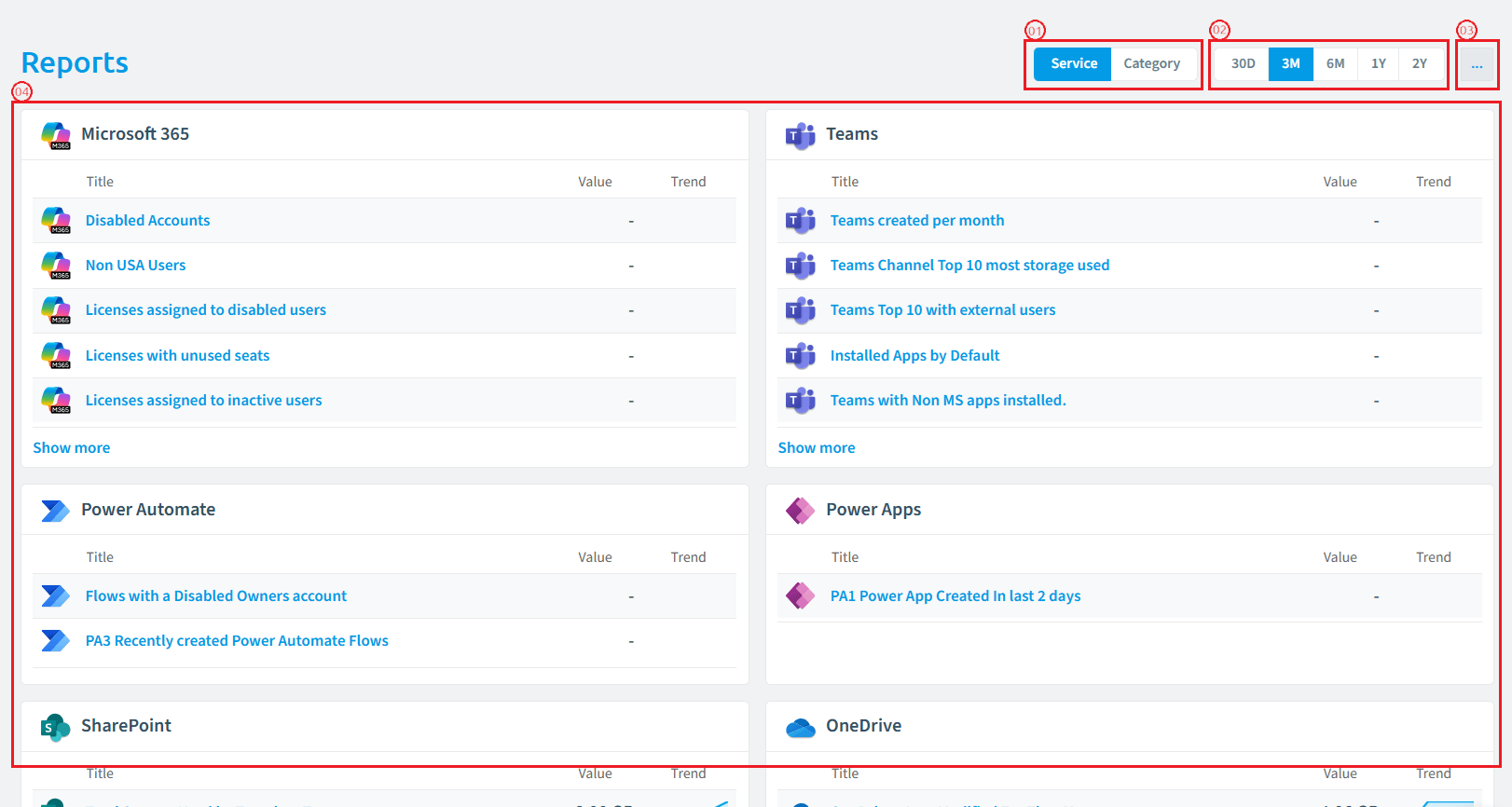
The Reports page is comprised of 4 components.
-
Service/Category Selector: As indicated in the diagram (position 1), the “Service, Category” selection button is on the top-right of the screen and allows you to group the top reports either by service or by Category (Security, Costs, External Access,…).
-
Date Range Selection: As indicated in the diagram (position 2), the date range filter will override the date ranges for individual tiles. This value defaults to “Last 30 Days”, but can be set to Last 90 Days, This Month, This Year, or a Custom Range.
-
Reports Ellipses Menu: As indicated in the diagram (position 3), the “Reports Ellipses Menu” is where you go to all reports or add a report.
-
Reports Tiles: As indicated in the diagram (position 4), the “Reports tiles”, whether grouped by service or category, will show:
-
Shows the top 5 trending reports (based on the selected period)
-
Include columns for each Report:
- Icon of the related service (matching Microsoft service icons).
- Title (name of the report).
- Value (current
- Trend _(line chart showing the report trend over time). _ The trend graph displays a percentage value with a + or - indicator to show growth or decline.
-
Hovering over a tile displays an option to “Go to Reports”.
-
“Show more” button loads additional reports, with the option to hide these again with “Show less”.
-
-
If a user clicks on the Title of a report, it will load the report.
-
If a user clicks on the Trend of a report, a side panel appears:
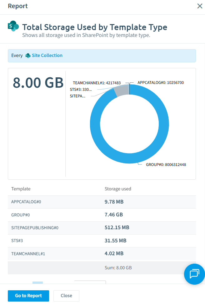
This panel will show:
- A definition of the logic of the report.
- A compact version of the report.
- Users can close the panel or go to the report.
Reports
**Reports ** let you visualize your governance plan that currently exists on paper into charts and graphs. By setting up a Report you can add these to dashboards and share them with your peers.
Rencore Governance comes with a selection of default reports that can be modified, and you can configure your own custom reports.
The Reports section comprises 9 components.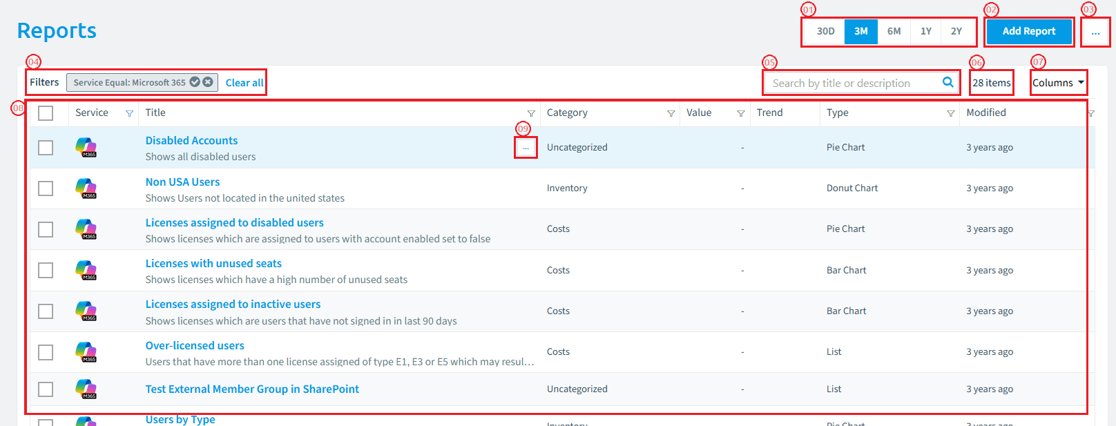
- Date Filter: As indicated in the diagram (position 1), the filter allows you to choose between 30 days, 3 months, 6 months, 1 year, or 2 years of the Reports’ trend.
- Add Report: As indicated in the diagram (position 2), the “Add Report” button is on the top-right of the screen and will take you to the “Report Template Library”, which is used for adding reports.
- Reports Ellipses Menu: As indicated in the diagram (position 3), the “Reports Ellipses Menu” is where you can import Reports.
- Current Filters: By default, the filters will be applied to the service you selected previously. You can remove individual filters or all filters.
- Report Search: As indicated in the diagram (position 5), allows you to search for a report by name or description.
- Count of Reports: This shows the number of reports shown in the data grid as per the filters applied.
- Column Selection: As indicated in the diagram (position 7), allows you to edit the columns shown in the datagrid.
- Reports: As indicated in the diagram (position 8), the reports are based on the current filter. The datagrid by default shows the Service, Title, Category, Value for the report, and Trend based on the Date Filter, the report type, and when the report was last modified.
- Ellipses Menu: As indicated in the diagram (position 9), hovering over the right of the report makes the “Ellipses Menu” appear. Clicking the menu allows you to; open the report, open the report in a new tab, edit the report, open the last job, clone the report, add the report as a tile to a dashboard, export the report, Share the report, Manage Shared reports, Create a segment from the report, create a policy from the report, or delete the report.
Policies
Clicking on Policies in the Navigation Panel leads to the policies landing page. This screen will group the top 5 policies for each service. You can change the grouping from service to Category and go to all policies.
A policy lets you put your governance plan, which currently exists on paper, into technology. Policies are your governance rules that you want us to monitor for you. By setting up a policy, we alert you when the policy is violated.
Rencore Governance comes with a selection of default policies that can be modified, as well as the ability to configure your own Compliance policies.
The Policy page is comprised of 4 components.
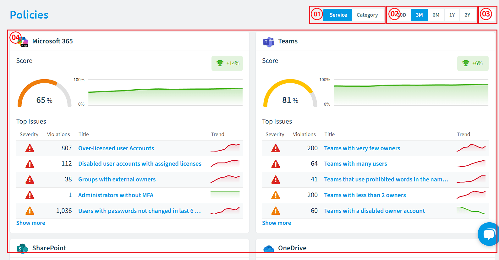
-
Service/Category Selector: As indicated in the diagram (position 1), the “Service, Category” selection button is on the top-right of the screen and allows you to group the top violations either by service or by Category (Security, Costs, External Access,…).
-
Date Range Selection: As indicated in the diagram (position 2), the date range filter will override the date ranges for individual tiles. This value defaults to “Last 30 Days”, but can be set to Last 90 Days, This Month, This Year, or a Custom Range.
-
Policy Ellipses Menu: As indicated in the diagram (position 3), the “Policy Ellipses Menu” is where you go to all policies or create a policy.
-
Policy Tiles: As indicated in the diagram (position 4), the “Policy tiles”, whether grouped by service or category, will show:
-
Score Section:
- Display compliance score represented as a circular gauge.
- Show percentage value in the center of the gauge (e.g., “79%”).
-
Top Issues Section:
-
Shows the top 5 policies with the most violations (based on the selected period)
-
Include columns for each Policy :
- Icon of the related service (matching Microsoft service icons).
- Icon of the severity.
- Violation count (numerical value with proper formatting).
- Title (name of the policy).
- Trend (line chart showing violation trend over time).
-
Policies are shown via severity and violation count.
-
The trend graph displays a percentage value with a + or - indicator to show growth or decline.
-
Hovering over a tile displays an option to “Go to Policies”.
-
“Show more” button loads additional policy violations, with the option to hide these again with “Show less”.
-
-
-
If a user clicks on the Title of a policy, it will load the policy and the current violations.
-
If a user clicks on the Trend of a policy, a side panel appears:
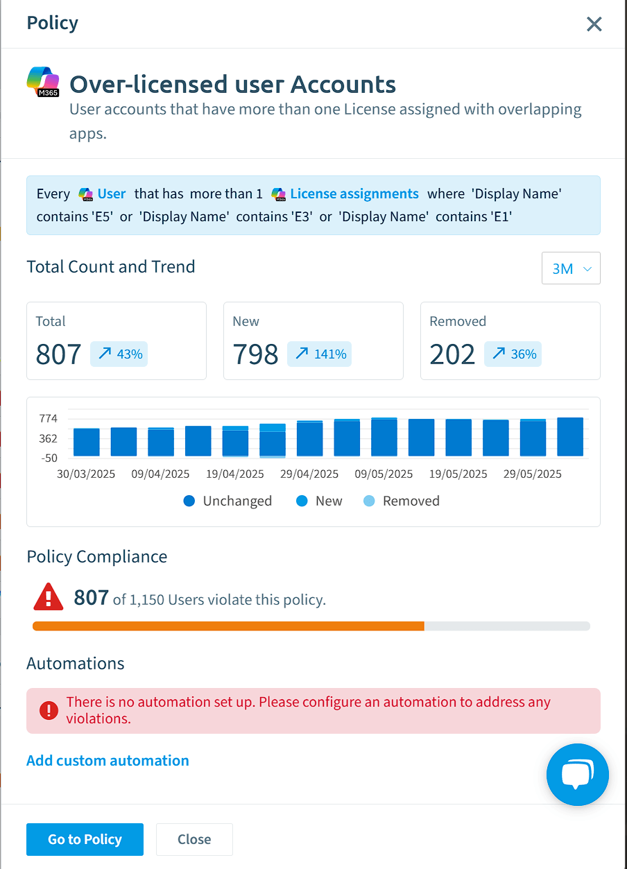
This panel will show:
- A definition of the logic of the policy.
- Total, New, and Removed count of violations (based on the date filter on screen)
- Total count of violations compared to the total value of the object (e.g. 807 users of 1,150 users violate this policy).
- List of the Automations that are triggered by the policy.
- Users can close the panel or go to the policy.
Automation
Automations are automatic process triggers that let you enforce your governance plan by triggering automation built with Power Automate, Azure Functions, Logic Apps, or notifications via Email or Teams whenever a policy is violated.
The Automation section can be comprised of 3 components.
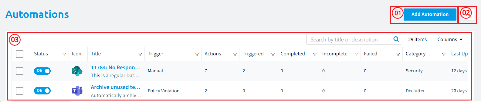
- Add Automation: As indicated in the diagram (position 1), the “Add Automation” button is on the top-right of the screen and will take you to the “Automations Template Library”, which is used for adding new automations.
- Automation Ellipses Menu: As indicated in the diagram (position 2), the ellipses menu permits importing an automation and setting the automation as the homepage.
- Automations: As indicated in the diagram (position 3), this is the list of all configured automation’s, which can be filtered by whether they are active, service type, name, trigger type, number of actions, number of times triggered, number of times completed, number of times incomplete, number times failed category, owner, and last update.
Access
Access reviews let users generate reports detailing which users and groups have access to content in the following areas: Microsoft 365, Teams, and SharePoint.
These access reports can be shared with the respective content owners, managers, or designated users, who can then review and, if necessary, update the access permissions for the content they manage (e.g., team owners).
The Access section can be comprised of 3 components.
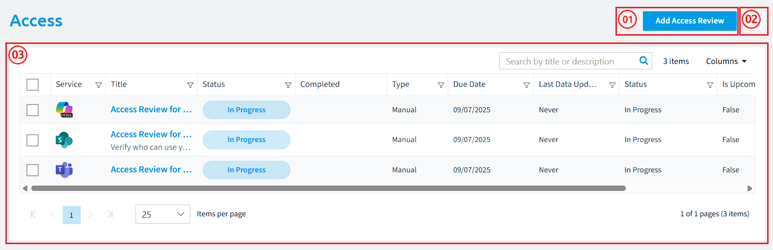
- Add Access Review: As indicated in the diagram (position 1), the “Add Access Review” button is on the top-right of the screen and will take you to the “Access Review Template Library”, which is used for adding new access reviews.
- Access Ellipses Menu: As indicated in the diagram (position 2), the ellipses menu permits importing an access review and setting the access review as the homepage.
- Access: As indicated in the diagram (position 3), this is the list of all configured access reviews, which can be filtered by the service type, name, status, type, due date, Last data update, whether the access is upcoming, and whether the review’s approval is overdue.
Provisioning
Provisioning provides a flexible yet governed approach to creating content in Microsoft 365 (e.g., SharePoint site collections, Microsoft Teams,…), ensuring consistency and compliance throughout the creation process.
The Access section can be comprised of 5 components.
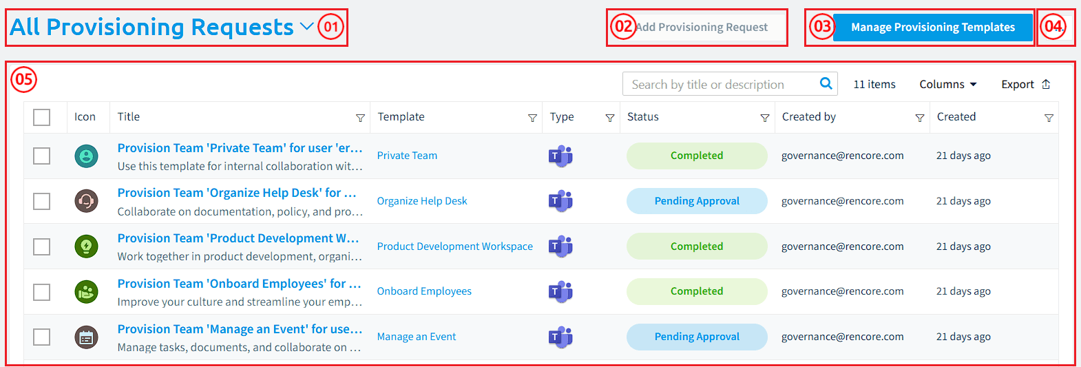
- Status Filter: As indicated in the diagram (position 1), the “Status Filter” allows you to filter between “All/Open/Failed” Provisioning Requests.
- Add Provisioning Request: As indicated in the diagram (position 2), it allows you to request a provision for a Team, SharePoint Site Collection, or Viva Engage Community.
- Manage Provisioning Templates: As indicated in the diagram (position 3), leads to the Provisioning Templates, where you can enable, disable, add, edit, delete, import, export, and stress test provisioning templates.
- Access Ellipses Menu: As indicated in the diagram (position 4), the ellipses menu permits setting the provisioning as the homepage.
- Access: As indicated in the diagram (position 5), this is the list of all provisioned requests, which can be filtered by title, template used, type, status, who created the request, and when the request was performed (Created).