
Workspace distribution dashboard
AI summary
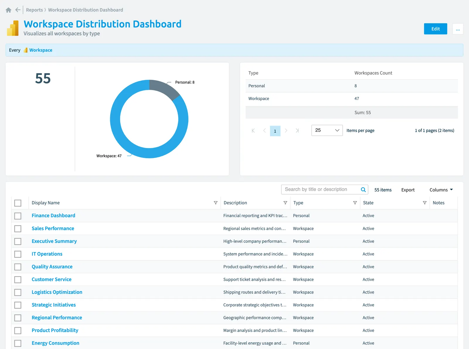
Use this Power BI report in Rencore Governance to see how your workspaces distribute by type in a donut chart.
"WorkspaceWorkspaceA Workspace is the top-level container in Rencore Governance. It holds the settings, users, roles and connected apps for exactly one Environment, the connected Microsoft 365 tenant.Read more distribution dashboard" is a report for Power BIPower BIPower BI is the Microsoft service for reports and dashboards over business data.Read more in Rencore Governance. Visualizes all workspaces by type.
What it shows
The report shows Workspace objects from the Power BI inventory.
The rule
Every Workspace
Chart
| Chart type | Donut chart |
|---|---|
| Grouped by | Type |
| Measure | Number of Workspace objects |
| Sorted by | Type, ascending |
| Limit | Top 5 |
In Rencore Governance
Details
Frequently asked questions
What does the Workspace distribution dashboard report show?
The Workspace distribution dashboard report: visualizes all workspaces by type.
Which objects does the Workspace distribution dashboard report use?
The Workspace distribution dashboard report works on Workspace objects from the Power BI inventory and shows them as a donut chart.
Which module includes the Workspace distribution dashboard report?
The Workspace distribution dashboard report comes with the Power BI connector in the Apps, Automation & BI module of Rencore Governance, an add-on module on the Premium and Enterprise Plans.
Was this page helpful?
Thanks for the feedback.
Thanks. What was wrong?